Subsweep
A subscription tracking service that combines functionality, privacy, and design to help manage our subscription heavy tech landscape.
🛼 Role
Solo UX/UI Designer
🎯 Skills
Ideation, Interviews, User Flows, Sketching, Wireframing, Visual Design
🛠️ Tools
Figma, POP by Marvel
⏳ Year
2023
🗓️ Duration
1 Month

Task
Design the mobile app for a web based personal finance tool that helps users manage recurring subscriptions.
Solution
A simple, flexible, private tool to track, manage, and cancel their subscriptions.
The Service
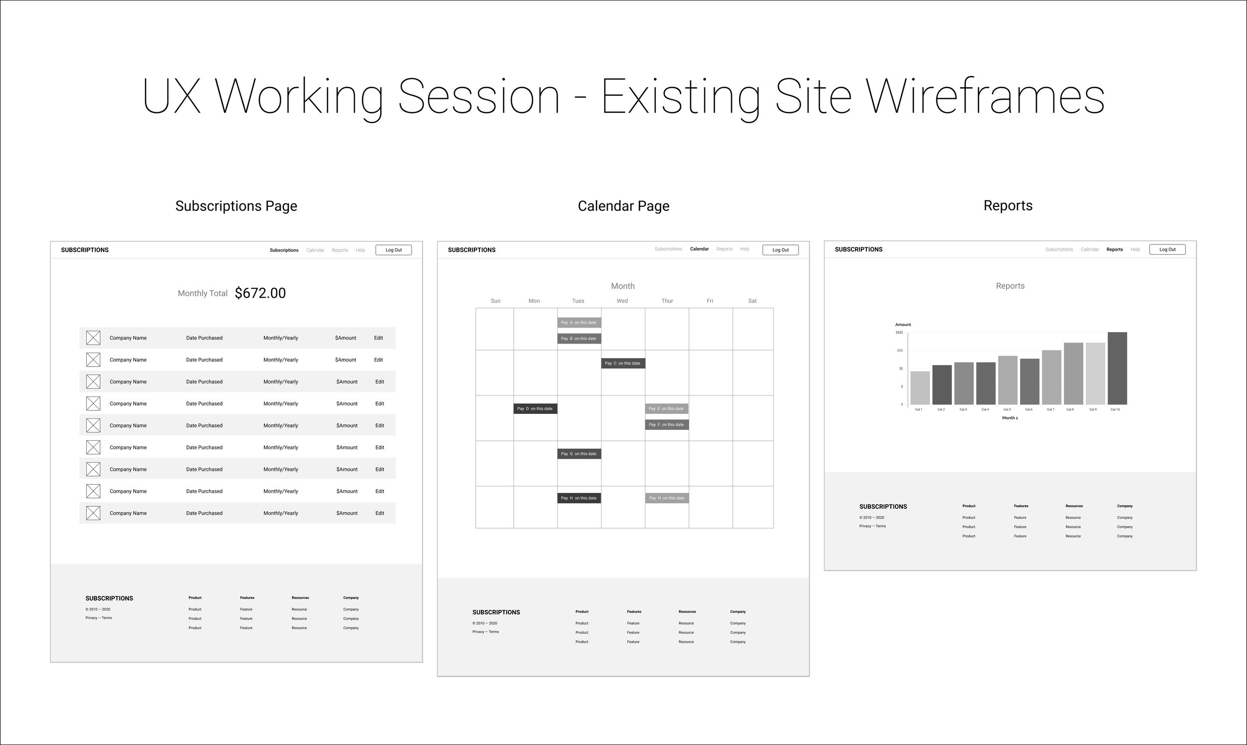
“It’s hard to keep track of all the products and services that we subscribe to each month. All we see is money deducted from our accounts for services that we might not need or want anymore. A company has a product that keeps track of all of your subscription fees over the years.
This company has only launched a desktop-only website that is not mobile-friendly and now needs to create a mobile version of its product. They know that adding a mobile-friendly version of their product will significantly increase their market reach (with more than half of potential users on mobile devices).”
USER STORIES
As a current user, I want to see all of my subscriptions in one place so that I can get a comprehensive view of my spending on subscriptions
As a returning user, I want to unsubscribe from a subscription so that I can reduce needless spending
As a consumer, I want to be notified if any of my subscriptions are about to be auto-renewed so that I can make a decision about if I want to renew the subscription and continue spending money
The Users
Information from the Product Manager
The majority of their users are age 25 - 40
Their user base is an equal split between men and women
While the product is currently used in the US, the company will be expanding to the German market.
Target User
Around 30 years of age
They use phone and desktop equally
Middle class
Trying to be more budget-conscious
RESEARCH
When everything is a subscription, how do you keep track?
According to Zorua Inc.’s biannual Subscription Economy Index (1), the number of companies using subscription based business models grew by more than 300% between 2012 and 2019, and this change shows no sign of slowing down.
Leaders in subscription tracking
Several apps and services already exist to fill this niche. RocketMoney (Formerly Truebill) and Intuit Mint are two of the most popular mobile personal finance apps that include automatic subscription tracking.
TrackMySubs is a desktop service that is unique in that it allows users to add subscriptions manually, which for security conscious users may be more appealing than allowing an app access all of their bank records.
For this app, there is an opportunity to create a mobile service that allows both manual and automatic tracking, depending on individual needs.
INFORMATION ARCHITECTURE
Drawing to roadmap: Features and User Flows
For this project it was vital to drill down on the basics of what users would need to manage their list of subscriptions: Namely the ability to ADD, REMOVE, FILTER, and EDIT what is being tracked. Each of the 3 major flows deals with one or more of these functions.
FIRST SKETCHES AND WIREFRAMES
Following the information architecture established in the previous section, screens were designed using pencil and paper. TrueBill and Mint served as inspiration as they were the products that represented the best of mobile personal finance app design.
In preparation for the first round of user testing, the first round of sketches were reworked digitally for clarity and ease of use.
USER TESTING
Does it actually work? First round testing
Four user interviews were conducted over Zoom, where volunteers were tasked with finding large, structural problems with the app design by interacting with a simple POP by Marvel prototype.
Key Takeaways
Users tend to get overwhelmed by long forms, especially ones that require extensive scrolling.
Text explanations for basic functions are crucial for helping users navigate unfamiliar software.
Security and privacy are foremost concerns, especially for older users.
Visual Design
UI KIT
Design based on the Payou Dark UI kit and design system.
COLORS
Colors reflect the friendly-yet-modern brand personality, in an eye strain friendly dark palette.
TYPE
Main typeface: Poppins by Jonny Pinhorn.
Accent typeface: Comfortaa by Johan Aackerlund
Buttons & Cards
ILLUSTRATIONS
“Space” illustration from TanahAir Studio’s Empty State Illustrations pack. Colors customized to fit color scheme.
ICONS
Most icons are drawn from the Hicon free icon set by Hadi Sharifani. Some are customized for the app’s specific functions.
Layout
The app was designed using a 10x10 pixel grid and 3-column structure. Spaces between objects were in multiples of 5 pixels.
BRAND PERSONALITY
“A trusted friend helping you save money.”
Brand attributes: Trustworthy, caring, friendly, casual
High Fidelity Mockups
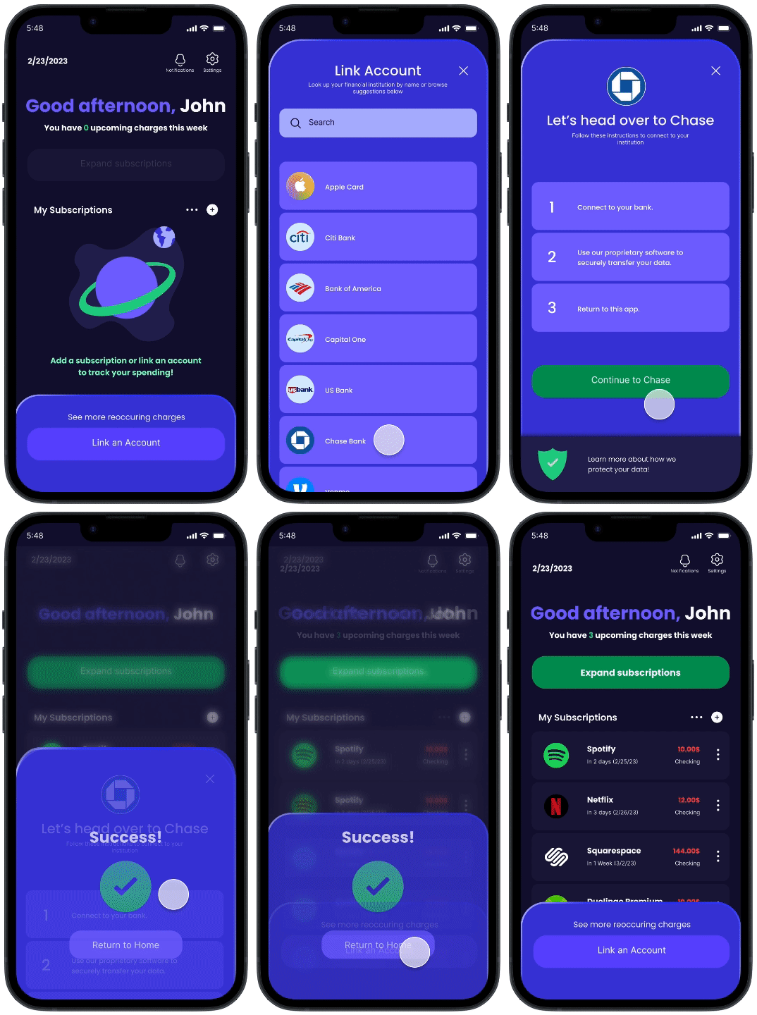
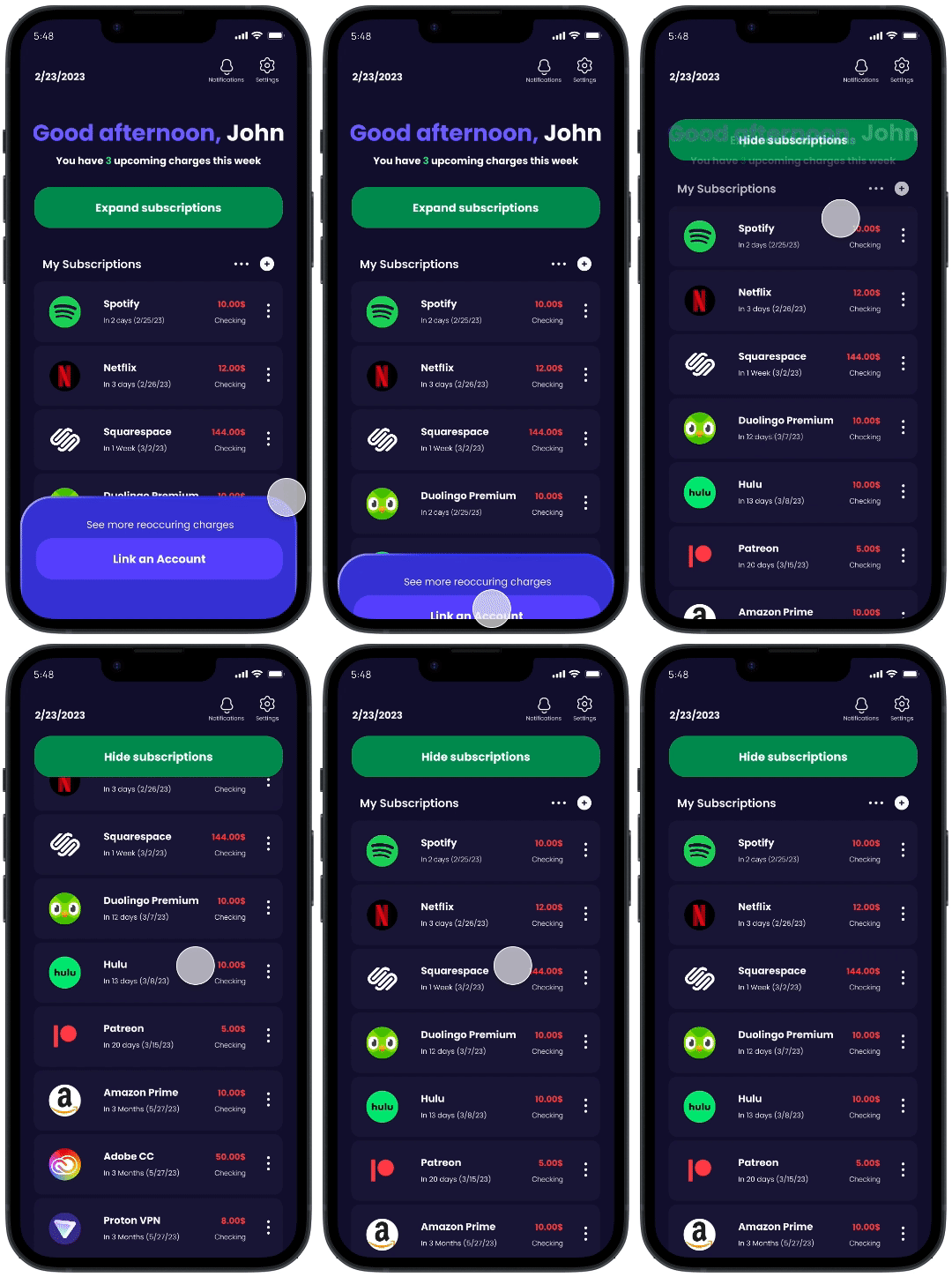
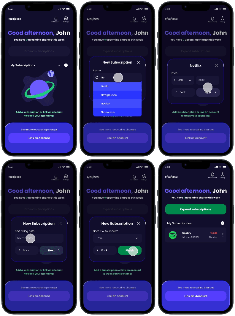
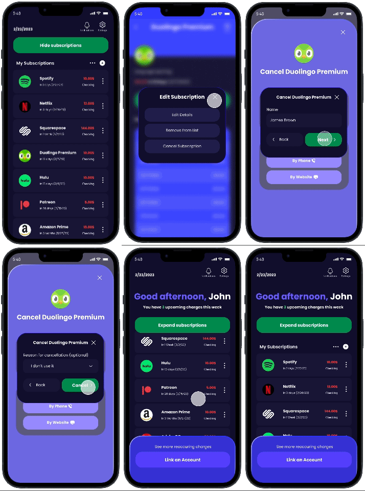
For the second round of testing, the information architecture and basic screens established in the previous section get merged with the visual design guide. The screens here represent 3 of the most crucial user flows.
Manually add a subscription
Connect a bank account or credit card
Cancel a subscription
User Testing (Second Round)
The same four volunteers from the first round of testing were given the opportunity to complete key tasks associated with the three major user flows, using a high fidelity prototype of the app.
Final Changes
Problem: Users frequently tapped on buttons that were supposed to be unclickable.
Solution: Reduce saturation and contrast of null state buttons.
Problem: Users accidentally tapped on the sort/filter or calendar view buttons when trying to add a subscription.
Solution: Increase the space between the buttons.
NEXT STEPS
As a student project, Subsweep was a learning experience, and the limited time frame meant that not every feature could be fully explored.
Some important functions, like the calendar view, got mostly ignored in the final draft.
The ability to sort and filter charges could be further developed down the line.
More time spent on earlier stages of the design process, like user flows and sketching, would have saved time on high-fidelity designs down the line.
