GalleryPal
A simple way to get more out of your museum visit—No tour guide or long, dense articles required!
🛼 Role
UX/UI Designer
🎯 Skills
Ideation, Interviews, User Flows, Sketching, Wireframing, Visual Design
🛠️ Tools
Figma, POP by Marvel
⏳ Year
2023
🗓️ Duration
5 days

Task
Museum visitors want more information about the artworks they see, but often become overwhelmed by dense articles and books. Using an abbreviated version of Google Venture’s 5-day design sprint, design a product to help them do that.
Solution
A mobile “virtual tour guide” that provides key context and interesting facts about artwork, right there in the museum.
Day 1: Understand & map
Background
For this challenge, the user research indicates that many museum-goers want to know more about the art they are viewing, but become overwhelmed by overly long or dense information.
Expert Interview
The interview with tour guide Lena Caroll also uncovered some specific insights regarding what information guests tend to seek out and what makes for a good museum tour.
Key Takeaways
Guests tend to want to know tidbits of information about the artist and time period that puts the work in context.
Guests also often want information about the technical process that went into making the art.
This is especially important for a lot of modern art, whose abstract compositions and experimental ideas might not immediately resonate with viewers.
Persona
The resulting persona is that of Angela, a 23 year old art director who has recently moved to New York, where she enjoys visiting the city’s many art museums to see what they have on display.
GOALS: Angela wants to get quick information while looking at the art that will give her a better appreciation for it, and make her feel like she is making the most out of her visit.
BEHAVIOR: Since moving to New York, Angela has tried to take advantage of all the art and museums in the city. She goes to museums every couple of months—usually by herself. Angela doesn’t look for specific exhibitions or artists—she just goes and browses whatever work is being showcased.
FRUSTRATIONS: Angela enjoys her visits, but feels like if he knew a little more, she would have a better experience. Angela has tried to read some books and articles on the art she’s seen, but loses interest due to how long and in-depth they are.
“I don’t need to know everything, I just don’t want to feel like I was missing out on something.”
“I enjoy going to the museum, but I often leave feeling like I didn’t appreciate the art to its full potential.”
How Might We…
How might we give users information in a way that is not overwhelming?
How might we seamlessly integrate the product into a museum visit?
How might we help users find a deeper appreciation for the art they are looking at?
Experience Map
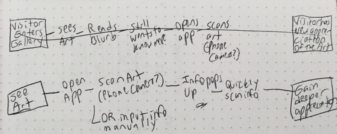
The experience map outlines the user’s experience of using the app from start to finish.
One of Angela’s paint points is that information about artworks tends to be too long and dense, so this app could serve as a virtual tour guide—a tool that can quickly and concisely explain important facts, in a conversational tone.
The map: User sees art → Opens app → Scans the art using camera → The information pops up → They skim the information, or read the sections in depth → They “favorite” the work to come back to later → They walk away with a deeper appreciation for the art
Day 2: Sketch
Lightning Demos
“Lightning demos” give us the opportunity to explore how other designers have attempted to tackle a similar problem. Wikipedia is a popular first stop when learning about an unfamiliar concept. Art Daily is designed to convey information about art and artists simply and easily, while Smartify is designed as a museum companion similar to this app.
Key Features
Hero image
Basic information: Title, artist, date of creation, etc.
More detailed information, organized by topic
“Favorite” button for easy recall
Crazy 8’s
“Crazy 8’s” is a brainstorming method that involves folding a piece of paper into 8 sections, which are then filled as quickly as possible with potential solutions to the problem.
Solutions for the Gallery Pal app ranged from the basic wiki format, to dividing up information into tappable “drawers,” to a word-cloud-like layout.
Solution Sketch
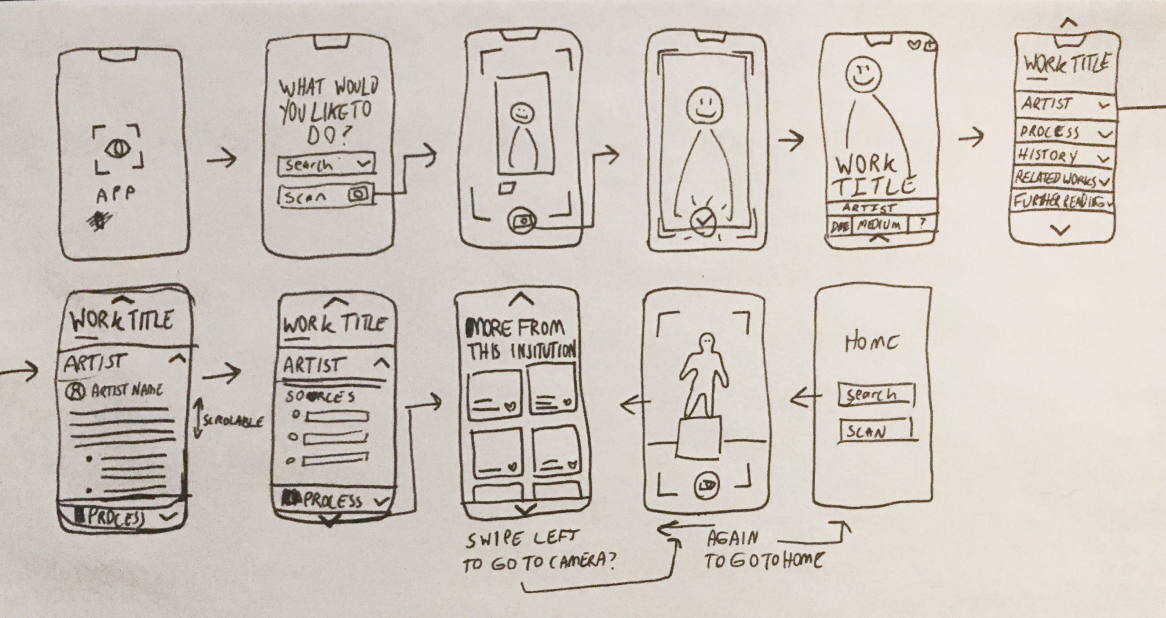
Expandable sections, navigated by swiping up, down, left, or right, will ideally provide enough information to satisfy Angela’s curiosity while also being simple to use in a museum setting, striking the balance between ease of use, comprehensibility, and thoroughness.
DAY 3: Decide
Storyboard
Following the basic structure laid out in the experience map, the storyboard takes the user from the point of scanning the painting, to browsing information about it, to seeing more works from the same institution.
Day 4: PROTOTYPE
High Fidelity Screens
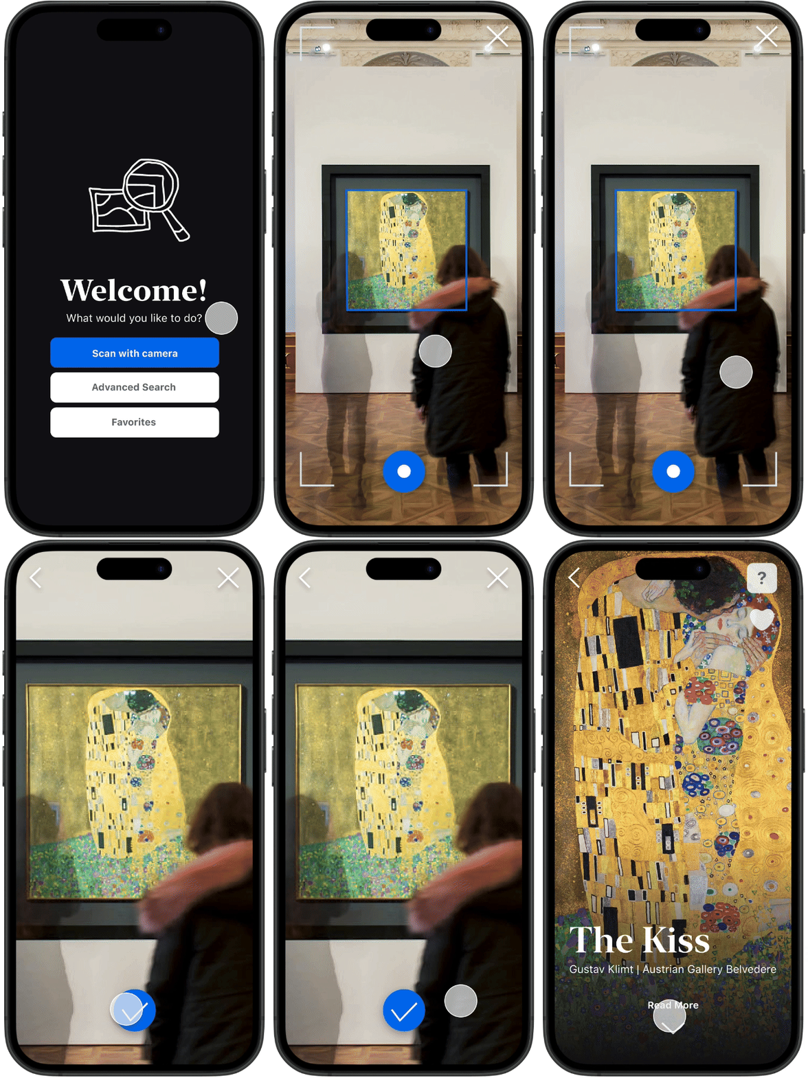
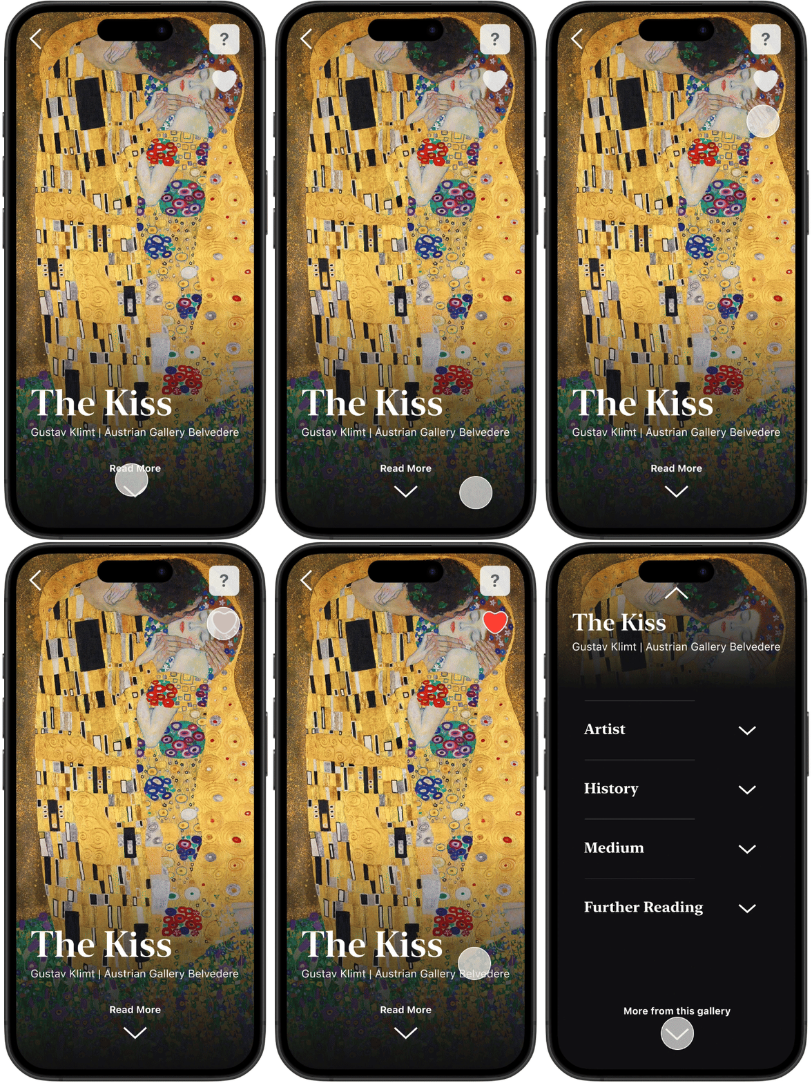
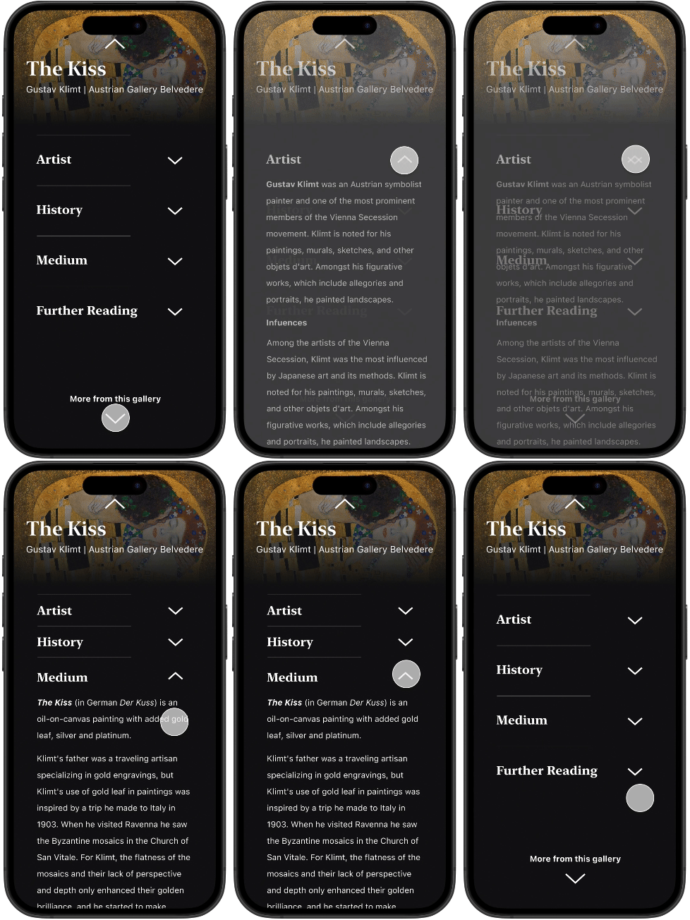
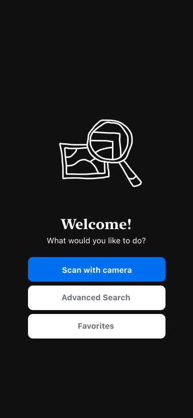
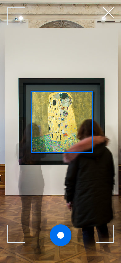
The first prototype was created based directly on the storyboard. UI was create to be as simple and legible as possible, including a quick illustrated logo. Extra steps for troubleshooting if the app’s theoretical AI incorrectly identified an artwork were included due to the imperfect nature of image recognition technology.
Day 5: Test
The prototype was tested in four ~15 minute long sessions with participants who, like Angela, are occasional museum visitors but not extremely knowledgeable about art history. They were tasked with finding out which materials were used to create The Kiss by Gustav Klimt, a piece of information that could only be found if they successfully navigated to the final screen.
3/4 participants were able to find the required information
4/4 found the “heart” button, but only one was able to find the “favorites” section without prompting.
The app initially took participants to the “wrong” artwork, which they had to correct, but 2/4 required prompting to realize that the artwork was wrong. I believe this confusion to be a result of the prototype and testing process, not the app concept, but further testing might be necessary.
Changes & UI Update
Problem: Accessibility audit revealed that the blue button color was too light to use with white text. Solution: A darker color to increase contrast.
Problem: Users had a difficult time finding the “favorites” section. Solution: A favorites button on the home screen.
Minor visual adjustments, including a sans-serif display typeface for a sophisticated edge.
Next Steps
More focused testing may be needed to decide how to approach the “AI troubleshooting” function. While assuming that the app’s AI will be correct most of the time minimizes the user’s time-to-value, it also runs the risk of giving out false information without the user realizing.
A key aspect of an app like this is that the information is concise, correct, and effectively conveyed. Deciding how the facts about the art are sourced, organized and curated will possibly make or break the final user experience.
Learnings
Design UI on a grid! For my first pass at the UI I eyeballed most of the sizes and distances for the sake of speed. Then for the second pass I had to spend hours adjusting everything to be consistent. Not worth it.
Breaking the design process down into small, manageable pieces can reveal key issues early, and reduces the mental load of working on a project solo.
Spending more time on preparatory work—like analog sketches and thumbnails—can save time working on high fidelity designs later.
